a little about the process i use to create these pieces:
every stroke should create as much mood, animation, life as possible. layering of colors is possible to a degree, but i try to use this sparingly. there's a lot of steady hand control needed, as well as precise placement of paints and inks to avoid bleeding and other unintended effects. there are many different ways to hold and load a brush, and though i am primarily using techniques i have observed and studied in one form of Chinese classical brush drawing, I very much freely incorporate my own vision and techniques. planning, execution and completion all happen rapidly, but only on the pieces which end up completed. it's common for a more complicated piece to be completed in 45 minutes, but only after spending hours on what i deem to be failures.
there is often a high degree of chance and a chaotic element that can really make or break one of these paintings. this can be controlled to a degree, but i've found that worrying about control too much creates unacceptable stiffness in the work. pausing often to reevaluate is crucial, but hesitation can be fatal to the piece and your sanity. but then, splatter and strokes, drips, stains- almost anything- may not ruin, but actually enhance a piece.
i paint these standing looking straight down at a high, flat desk which reaches my low-mid stomach. as in sign painting, it's good to hold your arm steady while moving your entire body at times, and this is necessary often enough to warrant this position.
tearing the paper before i begin has the same feel as a water mark or a signature, and it adds an organic texture to the piece while breaking up the static rectangle or square.
on top of this, i believe the tear highlights the fragile quality of all of these. they should not come into contact with any liquid, they are small and can easily be crumpled, burned, stained, etc... that's something i love about the final products of this process. i keep them in a very safe place.
The stamp is an ancient Chinese text, and is something I had made while traveling through Dun Huang city, Gansu Province in August of 2002. It reads right to left, "Kou Bing". Roughly translated, "Icy/cold Pirate". This was my first official Chinese name which has since been changed.
hope this helps/was interesting. feel free to message me with questions, and i'll do my best to accommodate.

frogs in the rain
10.25"x3"
water color and ink on torn paper
SOLD

dragon fly/ chick, fish and bee/ fish
water color and ink on torn paper
varies/3"
dragon fly: SOLD

frog and fly
10"x3"
water color and ink on torn paper

fish and bee
9.25"x7"
water color and ink on torn paper grocery bag


water color and ink on torn paper
 frog and bee
~6"x3"
water color on paper

water color and ink on torn paper
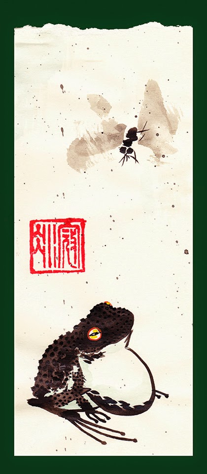 toad and fly
~7"x3"
water color and ink on torn paper

ink and water color on paper
UNAVAILABLE
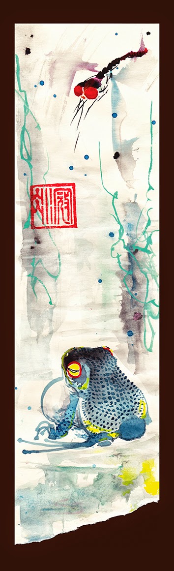 toad and dragon fly
11"x3"
ink and water color on torn paper

water color and ink on torn paper
 blood chick and ladybug (because it needed to be done)
~4.5"x3"
ink and water color on torn paper
more in the next blog, and after that...
1) EXCERPTS FROM THE FIRST 7 PAGES OF MY NEWEST COMIC WORK, WRITTEN BY THE HILARIOUS JASON LAMB, OF "THE CARL SHOW" FAME.
2) FINISHED PRODUCT: SANE SUIT VS. ELDRITCH ENTITY FROM BEYOND TIME, SPACE AND THE 3RD DIMENSION
03/04/2014 BLOG (here: http://cldahlstrom.blogspot.com/2014/03/blog-post.html )
9.25"x7"
water color and ink on torn paper grocery bag
frog and fly
10.5"x3"
water color and ink on torn paper
gold fish and bee with rain triptych
~12" squarewater color and ink on torn paper
~6"x3"
water color on paper
frog
~10.5"x3"water color and ink on torn paper
SOLD
~7"x3"
water color and ink on torn paper
toad in the rain
5.25"x3"ink and water color on paper
UNAVAILABLE
11"x3"
ink and water color on torn paper
green chicks
~9"x3"water color and ink on torn paper
~4.5"x3"
ink and water color on torn paper
more in the next blog, and after that...
1) EXCERPTS FROM THE FIRST 7 PAGES OF MY NEWEST COMIC WORK, WRITTEN BY THE HILARIOUS JASON LAMB, OF "THE CARL SHOW" FAME.
2) FINISHED PRODUCT: SANE SUIT VS. ELDRITCH ENTITY FROM BEYOND TIME, SPACE AND THE 3RD DIMENSION
03/04/2014 BLOG (here: http://cldahlstrom.blogspot.com/2014/03/blog-post.html )


s.jpg)


